


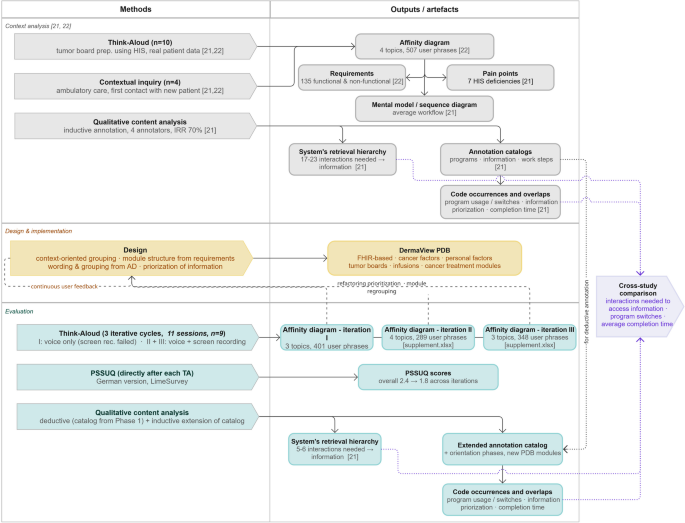
In this section, the development and implementation of a dashboard design, which was developed on the basis of findings from the context exploration phase, are described. To ensure that the design still met the requirements and mental model of the users, the implemented version was evaluated. This evaluation revealed the number of interactions required to access a single piece of information, and the switches between programs indicated the easier accessibility of treatment-relevant information. The results of the PSSUQ underscore the constructive adaptation of the dashboard by the physicians and they also highlight the positive effect of the iterative approach by demonstrating improved results with each cycle. The affinity diagrams helped identify the remaining problems with improving the dashboard, which were the lack of modules and the need for better data display.
Dashboard design
The application’s design is grounded in the requirements and mental models that were revealed during the context exploration phase. The 135 requirements were incorporated into the dashboard, resulting in the module structure depicted in Table 1. The top functional requirement (FR00) was identified as a comprehensive, user-friendly view of all patient data. The physicians’ mental model, as illustrated by the workflow sequence diagram, and the affinity diagrams drove the shift from an object/treatment-phenomenon-oriented to a context-oriented data grouping and terming in DermaView.
The workflow analysis revealed a high number of interactions necessary to access treatment-relevant information, thus emphasizing the condensation of all relevant information on a single page as the primary focus of the design. These findings necessitated the development of a dashboard for clinical care, with a focus on prioritized data and the option of accessing further information for detailed inspection only when necessary. This design choice is supported by prior usability research demonstrating that high information density does not inherently cause problems when data is relevant and well-organized, and that grouping display items logically on a single screen can outperform a tabbed, distributed layout41. Notably, no additional interactions are required to access the information once logged in. The login process necessitates a total of five interactions. As demonstrated in Fig. 2, the dashboard draft under review emphasized that the application modules are designed to be reusable across diverse clinical workflows and specialties.
Table 1 New modules of the view optimized for melanoma patients’ treatment and the contained information.Fig. 2
The dashboard design draft, including the nomenclature assigned to the various modules and their configuration for the treatment of melanoma. The utilization of distinct color frames serves to underscore the benefits of the design, namely the consolidation of all necessary information within a single page (dark blue), the facilitation of navigation between disparate perspectives (green), and the reusability of modules (light blue).
At the initiation of the project, a dashboard customized for radiology implementation at the UME was already in place, encompassing modules for patient master data, treatment history, laboratory values, diagnosis, procedures, imaging, documents, and medication. This established dashboard was adopted to develop a view designed for melanoma patients. The mental model was taken into consideration, and the data presentation was shifted from an object/treatment phenomenon-oriented approach to a context-oriented approach. Specifically, data were grouped not only by common resource type but also by their relationship with diagnostics and treatment (see Table 1 for a summary of the information points contained in the added modules of ‘cancer factors’, ‘personal factors’, tumor boards, infusions and ‘cancer treatment’). Additionally, the modules for master data, laboratory values and treatment history were adjusted to the context insights by optimizing the data display and allowing for a focused view of prioritized laboratory values, such as tumor markers, during melanoma treatment.
A selection of modules provides supplementary detailed views, including the option to examine laboratory values as a time-resolved graph in addition to the tabular overview. Furthermore, full clinical documents can be accessed within a dedicated viewer, and the comprehensive list of mutation results is available for review. It should be noted that the overview module displays positive mutation findings exclusively. Within the modules, users have the ability to navigate between tabs in order to access additional information. Color coding is employed in the laboratory to accentuate out-of-range results against the displayed reference range, a practice that is observed in both tabular and graphical representations. The recently implemented modules do not utilize color coding. The initiation of these detailed views or the transition between tabs from a patient record that has already been loaded necessitates an additional interaction.
Dashboard interactions and work steps
The task required the utilization of the PDB DermaView as the primary source of information for completion. Although users were permitted to switch to an alternative source when the PDB could not fulfill the requirements, all users successfully completed the task without additional information sources. The task involved the use of various modules of the PDB DermaView and an external text editor to prepare a case description, which is necessary for the tumor board registration that still needs to be entered using the HIS. Upon completion, most users provided direct feedback on the dashboard. This feedback-related activity was excluded from the analysis of workflow and program usage. The programs utilized are listed in Table 2 and supported by the analysis of the work steps conducted, which are highlighted in Table 3. For a more thorough examination of the annotations please refer to the supplement 1 (supplement.xlsx – tab “annotations”).
Table 2 Detailed statistics on the utilization of different programs and modules of the PDB DermaView, including percentage usage by participants, as well as the proportion of use in relation to the average total time. These statistics are broken down into two categories: those taking into account and those disregarding the use of the program.
Most time was allocated to the preparation of the case summary, with 67% of the participants utilizing an external text editor and 27% employing the tumor board registration mask directly. This activity constituted approximately 21% of the overall workflow, encompassing the steps of “formulating a question”, “editing the case summary”, and “completing the tumor board registration”. Accessing and reading the original patient diagnostic reports was an important part of each participant’s workflow, accounting for approximately 19% of the average workflow time. To access these records via PDB DermaView, the participant had to log in by performing three interactions, opening the patient file with another three interactions, and accessing the records from a list with two interactions. Thus, once the patient record is open, zero further interactions are required to access prioritized data, such as tumor specific data, e.g. tumor thickness and the presence of ulceration of the primary tumor, and up to two interactions allow access to detailed information such as full reports, full laboratory history, or complete molecular pathology results. The four modules of the PDB used by the majority of participants were progress documentation (100%), imaging (67%), tumor conference (67%), and medications (67%). The top three modules that users focused on the longest were progress documentation (2:34 min), imaging (00:39 min), and laboratory (00:29 min). On average, each participant used 7.8 different PDB DermaView modules, with a minimum of four and a maximum of nine. This resulted in a total of 27 switches between modules and programs with a minimum variance of 12 and a maximum variance of 38, of which approximately eleven were to external programs such as the HIS or the text editor.
Table 3 Work steps conducted during the participation, alongside the average time spent on each step, the proportion of this time in relation to the total task completion time (excluding the time taken for feedback), and the percentage of the work step occurrence in the different work flows of each participant. Work steps that were added during the annotation to name new interaction options start with“new >”.
PSSUQ
Fig. 3
The mean score of the PSSUQ results in conjunction with the results of each iteration for the four groups (“system usefulness”, “information quality”, “interface quality”, and “overall”).
Fig. 4
Distribution of responses for all 19 PSSUQ questions across all sessions. Response values range from 1 (strongly agree/very positive) to 7 (strongly disagree/very negative), with 0 representing “I don’t know” and 8 representing missing answers.
The results of the PSSUQ demonstrate an iterative enhancement of the PDB DermaView across all four groups, as illustrated in Fig. 3. The overall PSSUQ scores below 2.0 indicate strong positive user satisfaction36. The final overall score of 1.8 achieved in Iteration III therefore exceeds this threshold, reflecting a high level of perceived usability. Interface quality showed the most pronounced improvement, with the score decreasing from 2.6 to 1.3 — a 0.5-point improvement also observed in system usefulness and information quality between Iterations I and III. The questions, group building and results of each cycle can be found in the supplement 1 (supplement.xlsx – tab “pssuq”).
Figure 4 shows the mean score for each question, with the highest number of negative responses (2–7) occurring for questions 9–11, which pertain to error messages, handling, and solutions. Notably, these questions also received the least amount of feedback from participants. Conversely, the highest positive ratings (1 and 2) were attributed to Q1, Q2, and Q12, signifying the overall ease of task completion, the simplicity of use, and the accessibility of the necessary information. Notably, the highest positive ratings (1) were observed for Q3, which addresses the effectiveness of task completion using the PDB DermaView, and for Q12, which addresses user confidence in achieving productivity with the system.
Affinity diagrams
Fig. 5
Affinity Diagram construction and representative output. (a) Schematic of the hierarchical construction of an Affinity Diagram, shown exemplarily for the “time to familiarize needed” topic structure (Iteration III). Colors denote the four hierarchy levels (topic, subtopic, group, user phrase); solid connecting lines indicate the aggregation of child elements into their parent category, while dashed lines and boxes shaded in the corresponding hierarchy level’s color denote additional elements not shown for readability. For the topic and subtopic level, both the literal (translated) I-perspective statement used during analysis and the short label used in this publication for conciseness are given. User phrases are verbatim, literally translated participant quotes, labeled with anonymized participant identifiers (e.g., P10); these identifiers carry no demographic information. (b) Treemap of the complete Affinity Diagram for Iteration III, showing all identified topics (overlaying purple rectangle) and subtopics (shaded in orange; shading consistent for one topic); the number of user phrases assigned to each subtopic is given in the cell label following the semicolon, and cell area is proportional to this number.
The development of three ADs resulted in the identification of three topics, including 401 user phrases in Iteration I, 289 user phrases grouped into four topics in Iteration II, and 348 user phrases represented in three topics in Iteration III. The following text will consider only the topics and subtopics of each AD, using Iteration III as an illustrative example (Fig. 5, panel b). The complete hierarchical structure — groups, subtopics, and topics — for all three iterations, both as hierarchical tables and as treemap visualizations equivalent to Fig. 5, panel b, is provided in the supplement 1 (supplement.xlsx – tab ‘affinity diagrams’).
In all iterations, the preparation of the tumor board and information gathering, evaluation and decision-making were the strongest topics, with 176 user phrases in five subtopics in Iteration I. Since the second iteration, a stronger distinction between the topics and subtopics has been made. Iteration II revealed a stronger distinction between information gathering and information processing, resulting in three subtopics with 82 user phrases and two subtopics with another 60 user phrases, and Iteration III presented 131 and 114 user phrases in the four subtopics, respectively. The subtopics address the availability of any necessary information and the support of the workflow by fitting the visualization of the data.
In the first iteration, some ideas for improvement were extracted from 105 user phrases in four subtopics. Furthermore, the time necessary to become familiar with the PDB came to the center of the second and third iterations. The second Iteration Identified 90 user phrases in four subtopics, and the third iteration associated 103 user phrases with three subtopics. Although there was a necessity for a period of adjustment by users to the novel functionalities, the proportion of user phrases expressing frustration or error-related feedback underwent a considerable decline across iterations: from “errors” (120 phrases in four subtopics) in Iteration I, to “error occur while using the PDB” (57 phrases in three subtopics) in Iteration II, down to a single remaining subtopic, “problems getting started” (35 phrases), within the broader “time to familiarize needed” topic in Iteration III. These topics, in rare instances, address errors in the PDB and the potential for enhancing visualization techniques. However, they address primarily the lack of documented data, which could further improve the workflow and quality of documented free text.
The aforementioned PSSUQ scores provide further evidence that validates this shift. Furthermore, the number of user phrases referring to topics outside the assigned task, as well as the number of reported switches to external programs, both decreased between Iteration I and Iteration III. This suggests that physicians were increasingly able to focus on patient treatment rather than on software interactions. This finding aligns with the observation that no participant expressed concerns regarding information density or text legibility (e.g., font size) during the Think-Aloud sessions or in the PSSUQ responses. This is notable given the dashboard’s single-page design, which consolidates a substantially larger volume of information than the previously used HIS.
Cross-study comparison
The interaction efficiency was evaluated against the baseline health information system (HIS) that had previously been assessed during context exploration22,23. In that case, physicians used the existing HIS instead of PDB DermaView to prepare the tumor board. The interaction baseline, defined as the minimum number of clicks required to access a single piece of patient information from a closed record in the existing HIS, serves as the comparator for the present evaluation. The annotation catalogs created during the context analysis were reused deductively, enabling direct comparison of results across both studies. In this cross-study comparison of the interactions required to reach the same type of data point in each system, the number of interactions necessary to access a single piece of patient information was reduced from 17 to 23 to 5–6, including the steps of login and patient file access. Furthermore, when the record was already open, the number of interactions was reduced from 2 to 7 to 0–1, as the relevant information could be surfaced by identifying the corresponding module directly from the dashboard. Beyond the issue of interaction counts, physicians using the HIS also described experiencing a loss of orientation due to the technical instability of the interface (e.g., “It had somehow just closed all the windows.“) (context analysis; P10); no comparable incidents were reported during the present evaluation of PDB DermaView. In contrast, participants who used PDB DermaView described finding the necessary information with relative ease (e.g., “I was able to find the necessary information for this patient well.“) (P01).
Despite the reduction in required interactions, the mean task completion time increased slightly, from 13 min to 16 s (baseline HIS) to 16 min and 10 s (PDB DermaView). Of this increase, 2 min and 3 s were attributable to orientation time with the unfamiliar dashboard; excluding this component, completion time was 14 min and 8 s. Once oriented, physicians were able to swiftly identify the pertinent information, as evidenced by participant feedback (e.g., “[…] the more frequently you use it, the faster you find things again.” (P11).
The number of program switches increased from 25.3, with a variance of 14 minimum and 34 maximum, to 27, with a variance of 12 minimum and 36 maximum. It is important to note that this number includes switching between PDB DermaView modules that do not require user interaction or a changing view. In contrast, when the HIS is used, the majority of these transitions involve the introduction of new overlays and changes in views. As a result, the number of transitions to external programs was only eleven.
